
I recently posted myntra logo in pure CSS and I got a lot of positive feedback on how I created without using a single piece of an image.
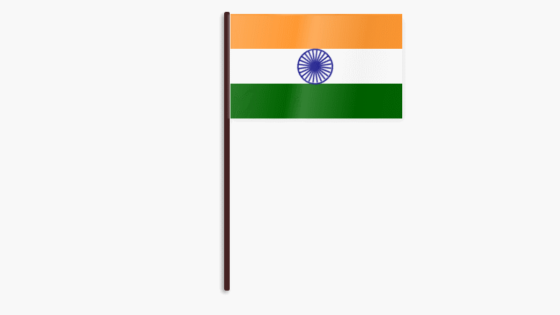
I decided to create another post to celebrate 67th Republic Day of India to explain how I managed to create animated Indian flag in pure CSS. I promise no image or javascript will be harm during this experiment. Lets get started ..
Creating Flag structure
1 2 3 4 5 | <div class="flag"> <div class="saffron flag-item"></div> <div class="white flag-item"></div> <div class="green flag-item"></div></div> |
As you can see I have a main “flag” area. to define tri-color I have also three divs nested.
Creating Ashok chakra
01 02 03 04 05 06 07 08 09 10 11 12 13 14 15 16 | <div class="white flag-item"><div class="circle"> <span class="bar"></span> <span class="bar"></span> <span class="bar"></span> <span class="bar"></span> <span class="bar"></span> <span class="bar"></span> <span class="bar"></span> <span class="bar"></span> <span class="bar"></span> <span class="bar"></span> <span class="bar"></span> <span class="bar"></span> </div></div> |
I have a circle div to create Ashok chakra, also, I have 12 spans to create 24 spokes.
To create waves I have another div “flag-wave”
1 | <div class="flag-wave"></div> |
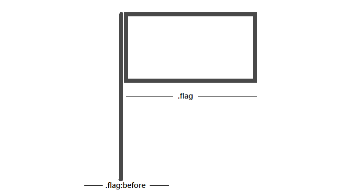
Lets styling the flag
first I have given position:relative to main flag div. To create a holding stick, I have added style to .flag:before the element. I have also added an animation to give a wave effect.
01 02 03 04 05 06 07 08 09 10 11 12 13 14 15 16 17 18 19 20 21 22 23 24 25 26 27 28 29 30 31 32 33 34 35 36 37 38 39 40 41 42 43 44 45 46 47 48 49 50 51 52 53 54 55 56 57 58 59 60 61 62 | .flag { margin:30px auto; position: relative; width:250px; height:150px; -webkit-perspective: 1000; -webkit-transform-style: preserve3d; -webkit-transform-origin: 0 250px; -webkit-transform: translate3d(0, 0, 0) rotateZ(0deg) rotateY(-22deg); -webkit-animation-name: wave; -webkit-animation-duration: 8s; -webkit-animation-timing-function: cubic-bezier(0.16, 0.14, 0.82, 0.73); -webkit-animation-timing-function: linear; -webkit-animation-iteration-count: infinite; perspective: 1000; transform-style: preserve3d; transform-origin: 0 250px; transform: translate3d(0, 0, 0) rotateZ(0deg) rotateY(-22deg); animation-name: wave; animation-duration: 8s; animation-timing-function: cubic-bezier(0.16, 0.14, 0.82, 0.73); animation-timing-function: linear; animation-iteration-count: infinite;}.flag:before { position: absolute; content: ""; height: 400px; left: -5px; top: -3px; width: 8px; border-right: 1px solid #FFF; border-radius: 3px; background-color: #422; box-shadow: -3px 3px 8px 0px rgba(0, 0, 0, 0.4);}@-webkit-keyframes wave { 0% { box-shadow: 4px 5px 5px 0 rgba(0, 0, 0, 0.1); -webkit-transform: translate3d(0, 0, 0) rotateZ(0deg) rotateY(22deg); } 20% { box-shadow: 4px 5px 15px 0 rgba(0, 0, 0, 0.1); -webkit-transform: translate3d(0, 0, 0) rotateZ(0deg) rotateY(0deg); } 40% { box-shadow: 4px 5px 20px 0 rgba(0, 0, 0, 0.4); -webkit-transform: translate3d(0, 0, 0) rotateZ(0deg) rotateY(-22deg); } 60% { box-shadow: 4px 5px 5px 0 rgba(0, 0, 0, 0.1); -webkit-transform: translate3d(0, 0, 0) rotateZ(0deg) rotateY(0deg); } 80% { box-shadow: 4px 5px 5px 0 rgba(0, 0, 0, 0.3); -webkit-transform: translate3d(0, 0, 0) rotateZ(0deg) rotateY(16deg); } 100% { box-shadow: 4px 5px 5px 0 rgba(0, 0, 0, 0.1); -webkit-transform: translate3d(0, 0, 0) rotateZ(0deg) rotateY(22deg); }} |
For every color I have used respective class according to color:
1 2 3 4 5 6 7 8 9 | .white { background: #FFF;}.green { background: #006400;}.saffron { background: #F93;} |
To create flag wave I have added the gradient effect in the background-image property. also added an animation effect air.
01 02 03 04 05 06 07 08 09 10 11 12 13 14 15 16 17 18 19 20 21 22 23 24 25 26 27 28 | .flag-wave { position: absolute; top: 0; left: 0; width: 100%; height: 100%; background-image: -webkit-gradient(linear, 0 -25%, 100% top, color-stop(0%, rgba(255, 255, 255, 0)), color-stop(20%, rgba(255, 255, 255, 0)), color-stop(30%, rgba(0, 0, 0, 0.04)), color-stop(40%, rgba(255, 255, 255, 0.2)), color-stop(60%, rgba(255, 255, 255, 0)), color-stop(65%, rgba(255, 255, 255, 0.2)), color-stop(80%, rgba(0, 0, 0, 0.05)), color-stop(100%, rgba(255, 255, 255, 0))); background-size: 200%; -webkit-animation-name: air; -webkit-animation-duration: 8s; -webkit-animation-timing-function: cubic-bezier(0.16, 0.14, 0.82, 0.73); -webkit-animation-iteration-count: infinite;}@-webkit-keyframes air { 0% { background-position: -200% 0px; } 30% { background-position: -60% 5px; } 70% { background-position: 70% -5px; } 100% { background-position: 200% 0px; }} |
Now I’ll create round circle div using border-radius property. Give an animation effect to rotating the Ashok chakra using transform: rotate property.
01 02 03 04 05 06 07 08 09 10 11 12 13 14 15 16 17 18 19 20 21 22 23 | .circle { width:47px; height:47px; border:2px solid #000080; border-radius:50%; position:absolute; left:40%; -webkit-animation: circle 5s infinite; animation: circle 10s linear 2s infinite;}@-webkit-keyframes circle { from { -ms-transform: rotate(0deg); -webkit-transform: rotate(0deg); transform: rotate(0deg); } to { -ms-transform: rotate(360deg); -webkit-transform: rotate(360deg); transform: rotate(360deg); }} |
That’s all folks. It would be great if you fork this in Codepen and improve. Happy Republic Day 2016.
0 Comments