
The new css3 specification provides two very useful css selectors :valid and :invalid. These are basically a pseudo-class which can work together with the form input element . Suppose you have an input element to check if an user types something correct or wrong. For checking, you only need to use html5 required attribute. Now with the :valid/:invalid selector you can edit or change the color of an input field so the user knows if it is correct or wrong. Let’s say a word is typed correctly, the input box becomes green. Like below:
1 2 3 4 5 6 7 8 9 | input:required { background: #AAA;}input:valid { background: #0A0;}input:invalid { background: #A00;} |
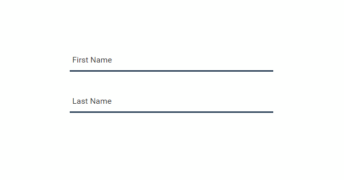
Today we’ll implement a material form where we’ll show validated result through :valid and :invalid selector. Here is our markup for a single textbox, we wrapped input[type=”text”] and label into bootstrap’s div.form-control div. we also have a bar which will be the indicator of validation color red or green.
1 2 3 4 5 | <div class="form-control"> <input type="text" required /> <span class="bar"></span> <label for="First Name">First Name</label></div> |
First we will have only bottom border blue(#34495e) to meet material design form style.
01 02 03 04 05 06 07 08 09 10 11 12 13 | .form-control { position:relative; margin-top:40px; width:400px;}input { border:none; border-bottom:3px solid #34495e; padding:10px 0; width:400px; display:block; font-size:16px;} |
our label will also work as a placeholder, so we need to set position absolute with appropriate left & top, So that by default it looks like a placeholder.
1 2 3 4 5 6 7 8 9 | label { position:absolute; top:8px; left:5px; font-size:16px; color:#333; transistion: 0.3s ease all; -webkit-transition:0.3s ease all;} |
Now when a user clicks/focus on the textbox, we will reset bottom border. we need to shift the position of placeholder to the top of the input that its looks like a label.
1 2 3 4 | input:focus{ border:none; outline:none;} |
the label will be up of the textbox until some user is focusing the textbox as well as typing any valid data.
1 2 3 4 5 6 | input:focus ~ label, .form-control input:valid ~ label { top:-10px; font-size:12px; left:2px; color:#111;} |
By default .bar will not be shown ie, the width will be 0, if someone focusing the text box .bar width will be increased. as you can see we have set width into .bar pseudo selector (:after/:before) so we will increase 50% (2 pseudo selector, total:100%) width gradually to provide nice css3 expand effects.
01 02 03 04 05 06 07 08 09 10 11 12 13 14 15 16 17 18 19 20 21 22 23 | .bar:before, .bar:after { content:''; height:3px; width:0; bottom:1px; position:absolute; transition:0.2s ease all; -moz-transition:0.2s ease all; -webkit-transition:0.2s ease all;}.bar:before { left:50%;}.bar:after { right:50%; }input:focus ~ .bar:before, input:focus ~ .bar:after { width:50%;} |
Now we will change bar background color according to valid/invalid data input using :valid, :invalid selectors.
1 2 3 4 5 6 7 | input:valid ~ .bar:before, input:valid ~ .bar:after{ background:#2ecc71; }input:invalid ~ .bar:before, input:invalid ~ .bar:after{ background:#e74c3c; } |
It works on: latest Chrome(10+), latest Firefox(4+), latest Safari(5+), Opera(10+) and IE10+. It doesn’t work on IE9 or below. This validation does not validate any data, you can use this only for some user experience purposes.
0 Comments